

Developing a responsive website for a local bakery.
Background
Mylk & Hunny Bakeshop is an all female-owned and operated local vegan bakeshop that doesn’t have a physical bakery but partners with local coffee shops to sell their goods. With the recent quarantine eliminating in store sales, the company now uses their strong Instagram and Facebook presence to advertise the date products become available for delivery through posts/stories. They’re able to process menu purchases, but the company would like to develop a responsive website to boost sales and streamline their special ordering process while staying true to their bold playful brand that their customers love and know.
Role: UX Designer
Timeline: 3 Weeks
Tools: Figma, Pen & Paper
Platform: Desktop, tablet, iOS, Android
The Challenges
Customers are familiar with the current purchasing process and need to be introduced to a new more unfamiliar process.
Special ordering involves details unique to that order, so predetermined input field options are limited.
Consumers are used to the company’s strong social media presence as a means of getting information which will need to be integrated into the website.
As a long time vegan I needed to ensure I design for the Mylk & Hunny Bakeshop customer and not myself.
Project Goals
Develop a responsive website that is easy to navigate.
Streamline the online ordering process.
Adhere to the bold brand that appeals to both vegans and non-vegans.
My Approach
Identify the company’s target market.
Identify what high priority information customers look for when they browse a bakery’s website.
Determine what information is needed to place special orders online.
Determine what assumptions prevent people from trying vegan baked goods.
Research & Empathize
What influences food decisions?
Being a long time vegan myself, I needed to be conscious of my biases throughout the design process. To understand current market trends and its consumers, I did market research and competitor analysis, as well as interviews with both vegan and non vegans. I then used the data to develop a persona of the primary customer which would provide me with direction for my design decisions.
Vegan is trending
Mylk & Hunny Bakery may be an all vegan store, but an increasing number of non vegans are beginning to try more plant-based foods. In fact, 39% of non vegans actively incorporate plant-based foods into their diets.
The message behind the food matters
A strong company mission & community involvement seemed to increase customer support for the business. Users want their money to go to a company with values they support based on other’s testimonials/reviews.
The demographics are in
At 44%, the highest percentage of vegans are ages 25-34, and 36% of vegans are ages 16-24. 74% of vegans are female, and are generally have left leaning views.
Define
Laying the foundations
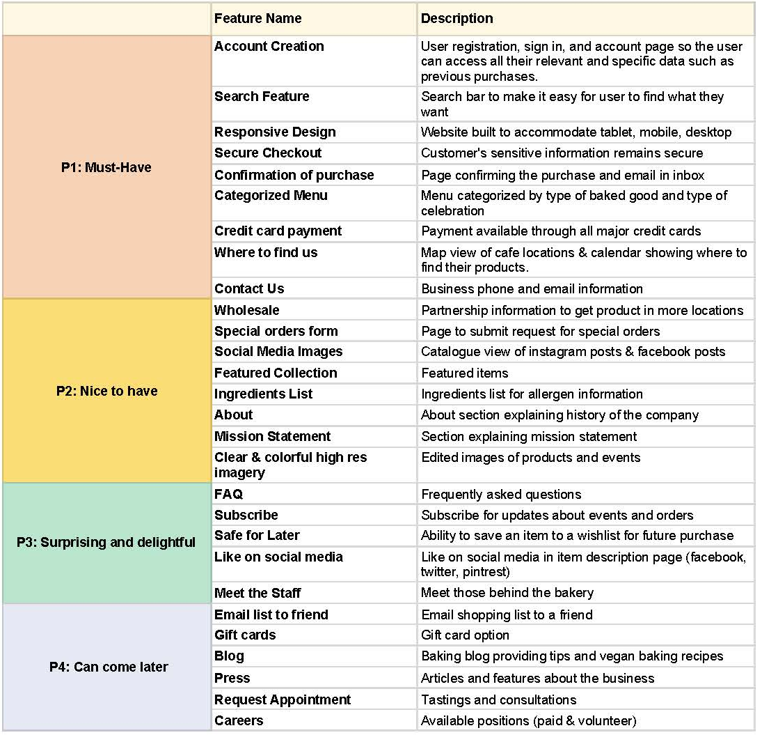
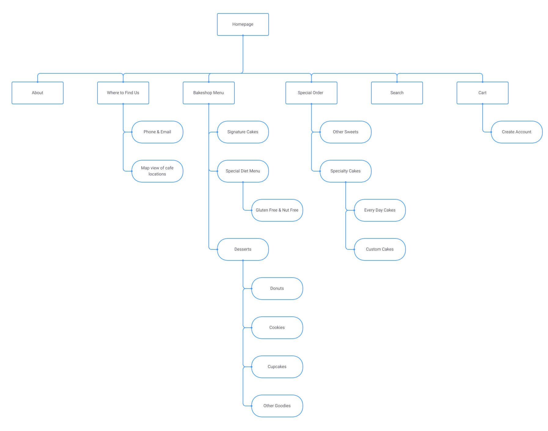
To prioritize features that would be included on the website, I listed them in order of importance to use as a guide for my designs. At the bottom was a section for low priority features that would be best for development in future iterations. I also created a sitemap to more clearly identify the site’s pages and how they worked together.
Creating a Userflow
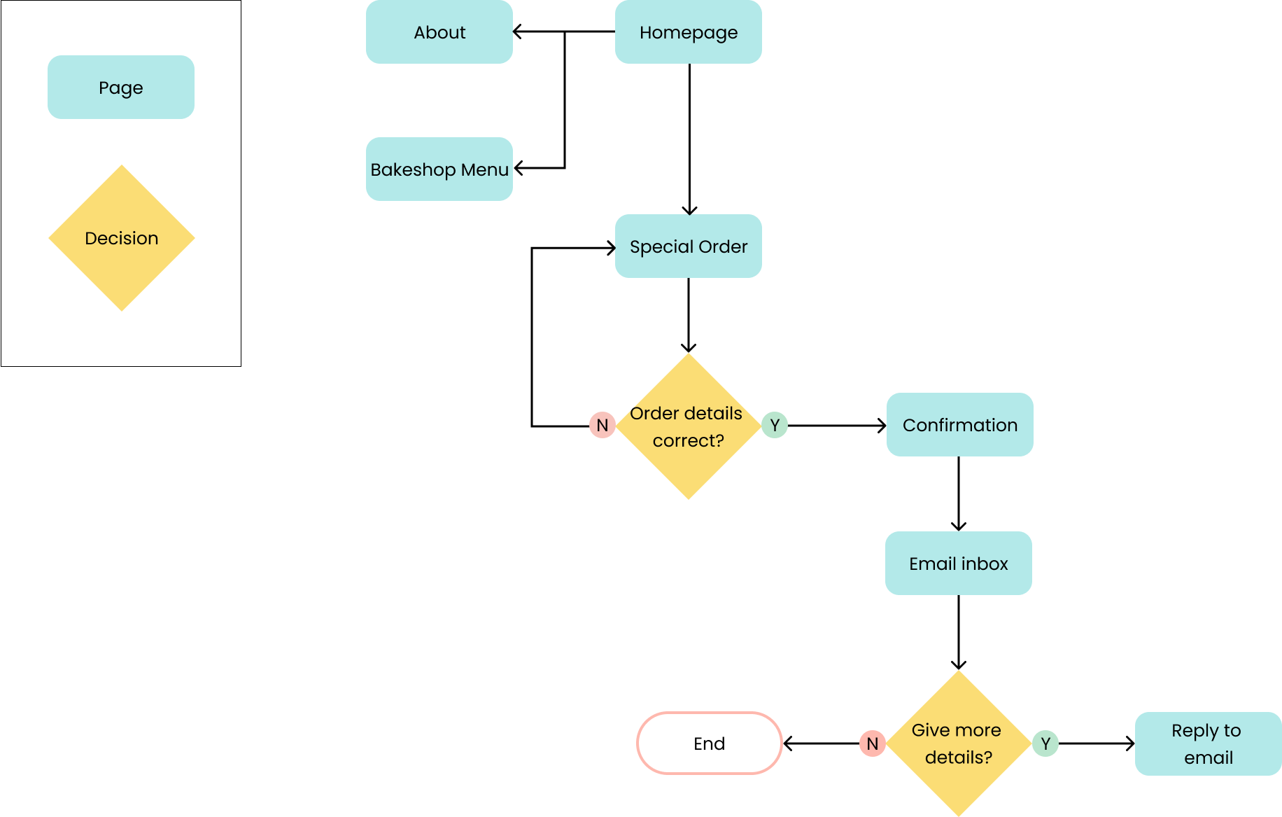
The company wanted to streamline the online ordering process with a focus on special orders, so I outlined the purchase flow for menu items and special orders from the perspective of our persona Taylor. Based on my research, users place a high value on other customer’s recommendations. So I created a flow where Taylor enters the website after a friend recommends the company.
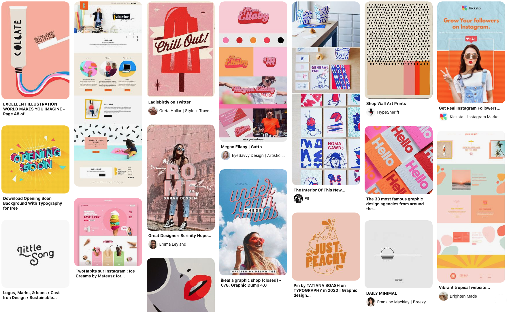
Company image
Because my designs would need to align with the current brand, I wanted to ensure I had an understanding of their values and image early on in the design process. Although the lo fi wireframes wouldn’t have UI applied, the layout should still accurately reflect the company. Based on my earlier research of the company I identified 3 words that described the brand:
Bold
Playful
Youthful
With these keywords in mind, I created a Pinterest board to gather inspiration.
Ideate
Considering business and user needs
Now that I had a better understanding of the structure of the website and who I was designing for, I created rough sketches before moving to lo-fi wireframes. My focus was creating wireframes for tasks that would help answer my project goals.
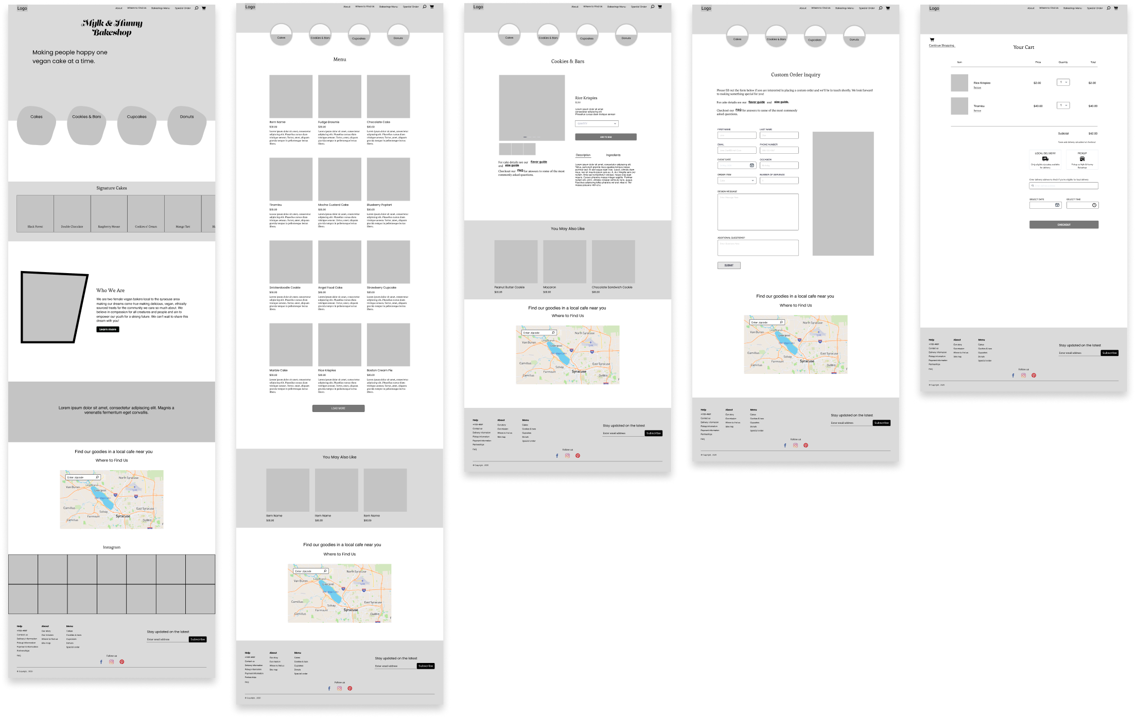
Prototype & Test
How do users navigate?
To test my designs I conducted usability testing via Zoom with 3 users who have tried vegan food within the last year. I wanted to test for hierarchy of information and navigation use. I was interested particularly in the content on the custom order page and how users interacted with the menu navigation.
Final Designs
Combining creativity with functionality
I gathered my data and synthesized it using an affinity map. This helped me identify patterns in participant’s answers and determine what would be the most effective changes.
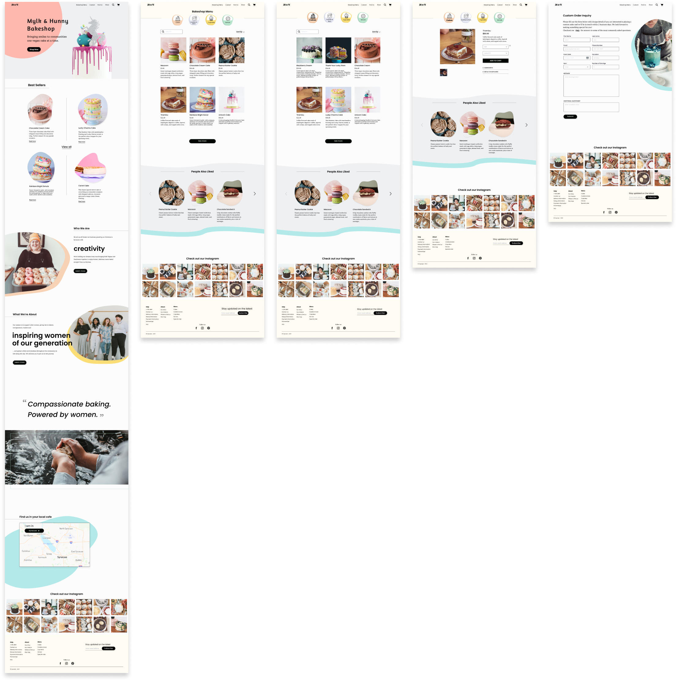
Creating balance
Balanced visual and information hierarchy with a clear call to action.
Increase readability
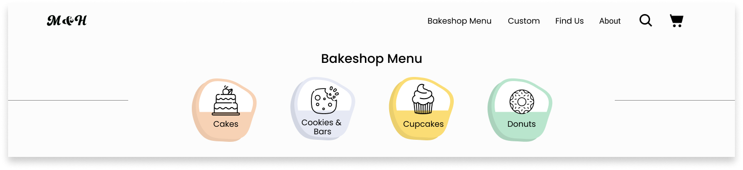
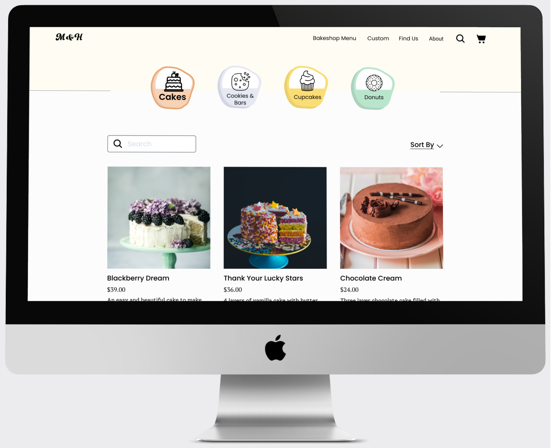
An enlarged icon and bolded text clearly conveys the menu category selected.
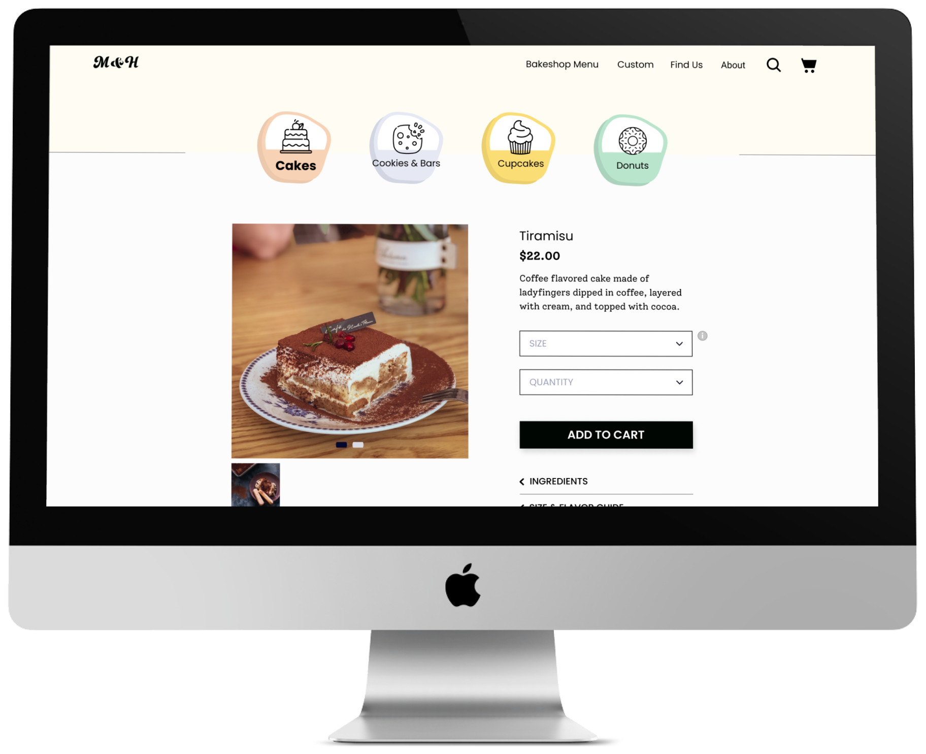
Cake shopping made easy
The cake’s size and quantity are
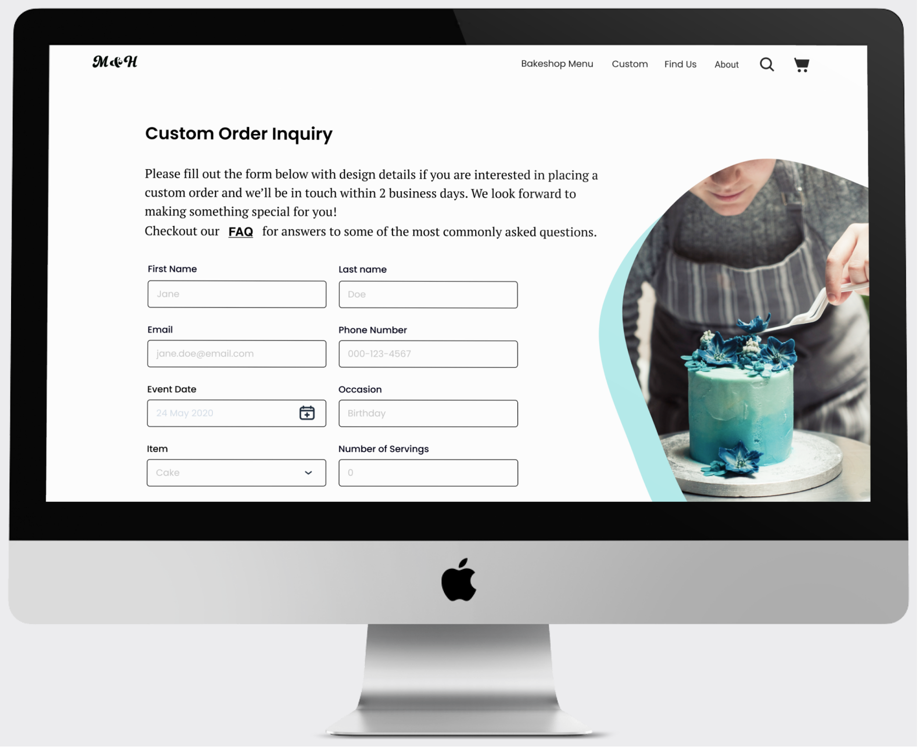
Keep it simple but detailed
Detailed but concise instructions request essential information to complete the special order.
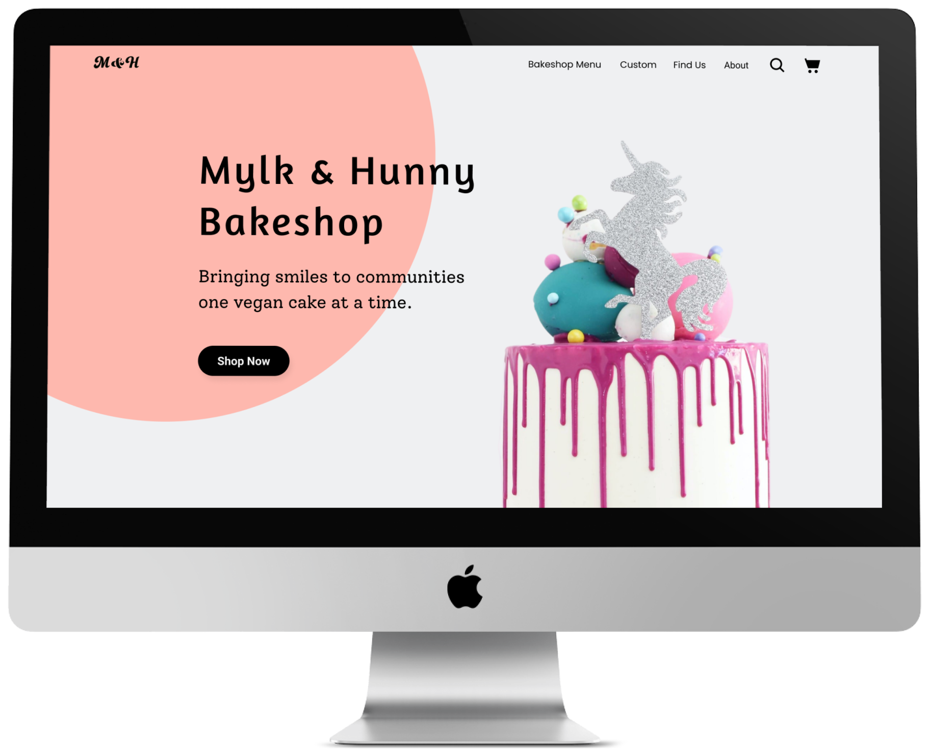
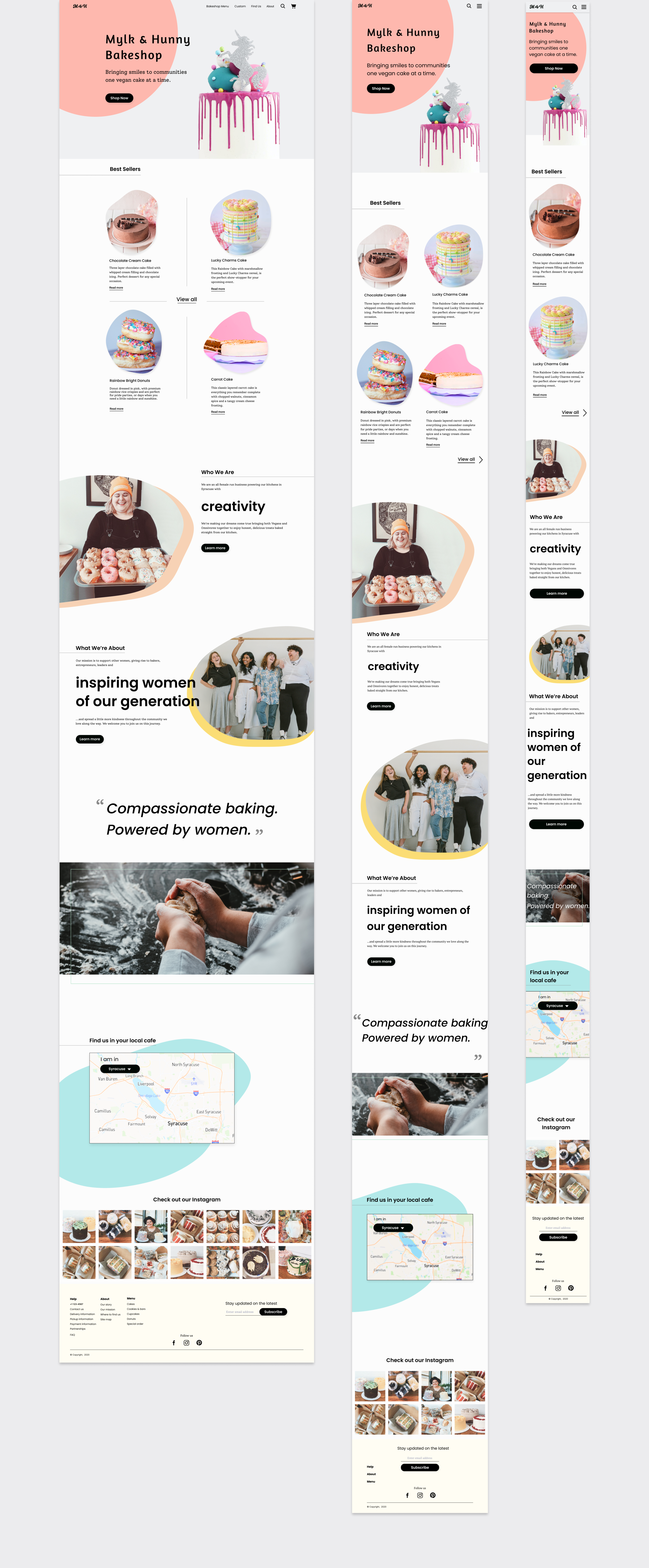
Making it responsive for the future
Once the wireframes had been edited based on the results of the usability testing with the UI designs, I wanted to make sure the website could be viewed on all devices for future iterations. I created responsive designs of the homepage for desktop, tablet, and mobile to ensure the bakeshop would have a jumping off point for further developments. I decided to adjust the bolded lettering for the tablet and mobile as I felt it was perfect for desktop, but might be overpowering on smaller devices.
Reflections
Looking ahead
Designing a responsive website for a vegan bakery was a great way to learn about designing for a specific market I was a part of, and taking extra care to be mindful of bias. Being thorough with my research to draw a clear understanding of the user’s needs and goals was critical to ensure clear directions for my designs.
In retrospect, I would have put a bit more detail into the lo-fi designs so that the single usability testing I had time to to perform would yield more definitive results. The next steps would be a 2nd usability testing with the UI designs to assess the effectiveness of the design solutions, and specifically the navigation use.