

An augmented reality app making furniture shopping easy.
Background
Heem is a theoretical new app for interior design that has partnerships with a number of top 10 furniture stores in the U.S. The company wants to provide consumers with the ability to view furniture in their own environment using augmented reality; a technology that has the potential to make online furniture shopping the superior experience. It gives consumers the power to reach any leading furniture brand and view selections in their space, potentially eliminating the need for consumers to step in a store.
Role: UX Designer
Duration: 3 Weeks
Tools: Figma, Pen & Paper
Platform: Android
The Challenges
Augmented reality is a powerful tool but it is still fairly new to the online shopping market and isn’t widely used by companies, which presents consumers with somewhat of a learning curve.
The augmented reality on apps are often slow to load and cause apps to crash, making the app unusable and shopping a cumbersome experience.
Consumers can’t rely on augmented reality as a reliable way to shop because companies don’t offer it for all of their products.
Project Goals
Develop a furniture app with augmented reality capabilities that will help consumers make decisions when shopping.
Design to allow consumers feel more confident about online shopping.
Help consumers shop more efficiently to easily find furniture that fits their needs.
My Approach
Evaluate how consumers decide to purchase furniture.
Determine how augmented reality helps consumers make decisions to narrow their search.
Explore how to enable consumers to shop efficiently without stepping into a store.
Research & Empathize
Augmented reality vs in store shopping
Based on my competitor analysis of 5 well known furniture brands and interviews with the 5 target users, I synthesized the data using an affinity map and identified themes in participant’s answers I categorized by in-store shopping, online shopping, virtual reality, and general shopping.
Research online and purchase in-store is necessary
Although consumers prefer shopping online, they often research online and purchase in-store. In fact, 57% of furniture shoppers purchase in-store, and 81% of consumers do research online first.
Consumers don’t trust a company’s representation of its products online
Participants had mistrust in company’s information presented online and viewed in-store shopping as a means to check a product’s features, quality, texture, comfort, and size. Although not ideal, in-store shopping was viewed as necessary for larger purchase items since it involved a larger investment.
Opinions are a big deal
Consumers highly value other customer’s input when deciding on a product as it’s a way for them to determine if the product information on the company website is accurate. For 75% of shoppers, the needs of the entire family are considered when buying. Shoppers value the opinion of their significant other and usually include their partner in the decision-making process.
Define
Consumers can’t try online products before purchasing
I framed insights from my research into problems that needed to be solved, and 5 “How might we” questions. From there I focused on 3 main questions to inform my design strategy.

How might we help consumers feel more confident about shopping online?

How might we help the consumer easily find furniture that fit their needs?

How might we make the company’s representation of products more trustworthy?
Ideate
Exploring Ideas
It was important to explore all factors that influence a shopper’s experience. Through brainstorming and competitor research I had previously identified similar core information architecture which allowed me to now focus on a few solutions.
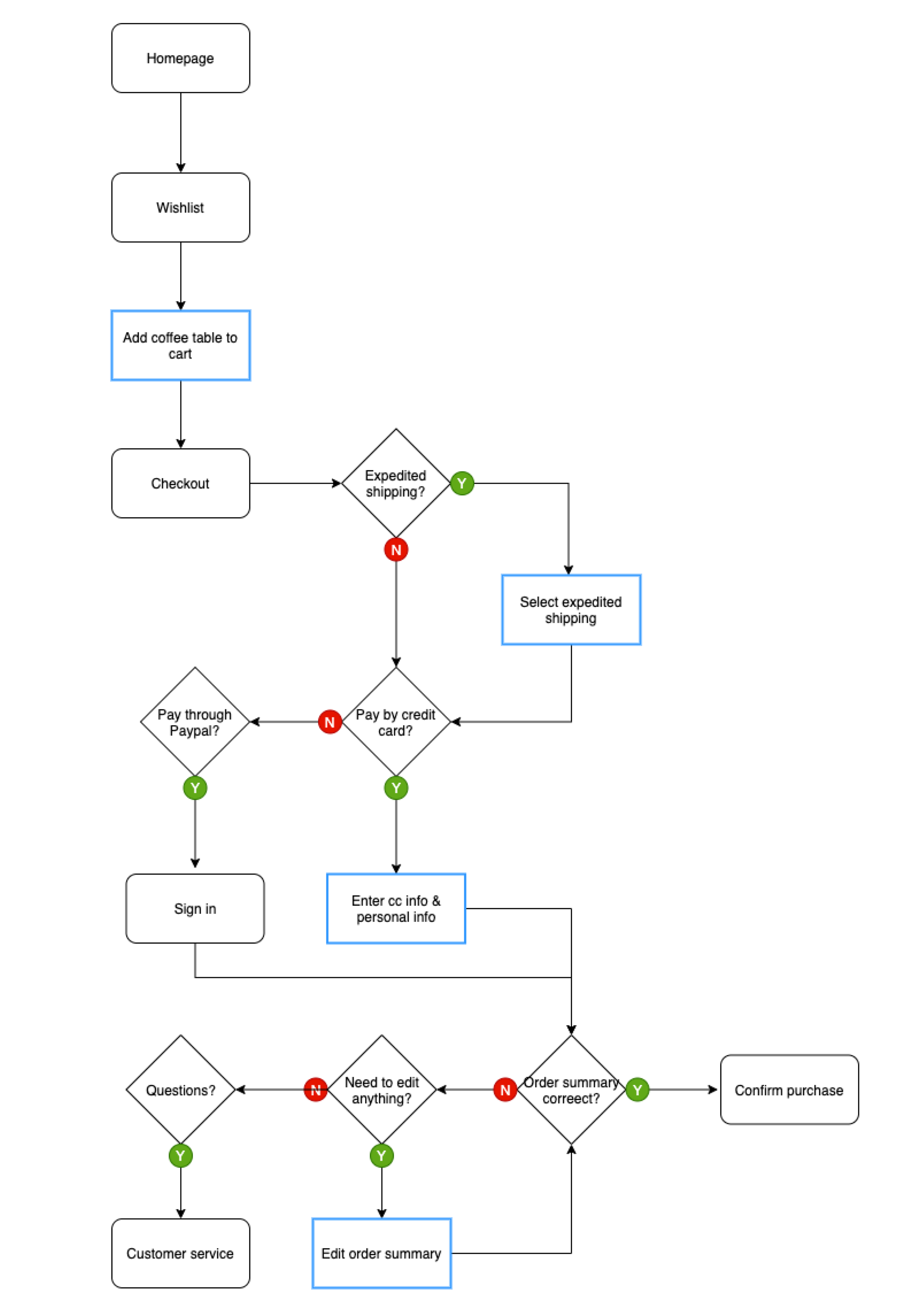
I created a persona Kerry based on my research. With augmented reality being so new, I wanted to understand how our persona Kerry would use it. So I created a user flow that was focused on Kerry’s interaction with augmented reality within the app.
Task #1: Kerry searches for a new sofa, views it in her home, and adds it to her cart.

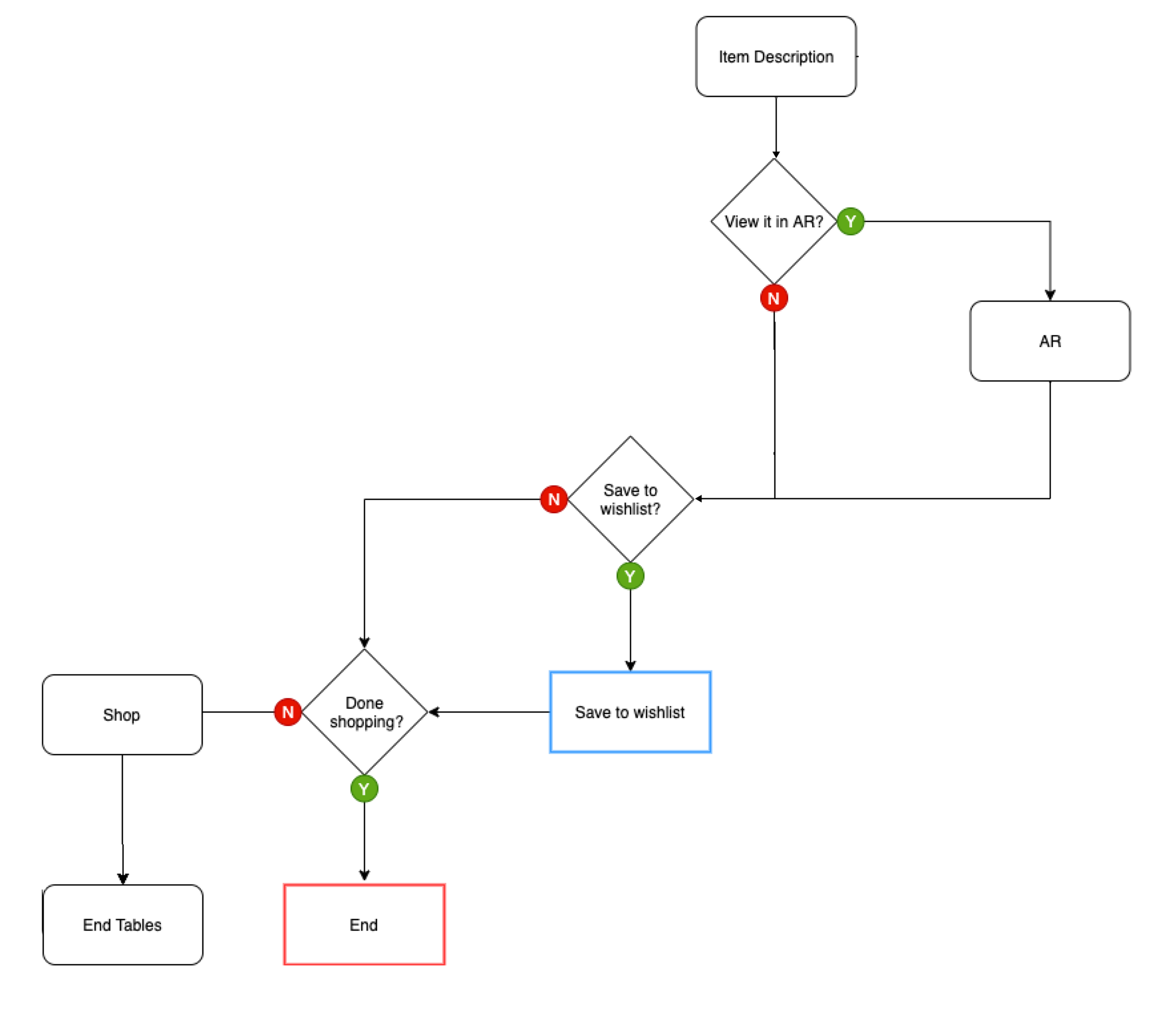
Task #2: Kerry searches for a new coffee table and adds it to her Favorites list.
Task #3: Kerry purchases the sofa and coffee table that was previously saved to her wishlist.
Turning ideas into actions
With my 3 main questions in mind, I created low-fi wireframes for tasks I wanted to test. I wanted to focus on the functionality of the app rather than visual embellishments, so I kept the wireframes simple. I incorporated ideas discovered in the brainstorming stage such as:
Easy & intuitive design
Customer ratings
Inspiration rooms
Recommended products
Color swapping

Final Designs
Using words that matter
The first usability testing gave me some deep insights into the user’s comprehension of the designs which lead to revisions related to icon choice, navigation, and instructions. A 2nd round of usability testing was then conducted focused now on user’s thoughts on specific design choices in the context of UI.

Welcoming the user
The home screen provides a clean and cohesive design and a clear call to action.

Picture search for more accurate results
By tapping on the camera icon in the top navigation users search for furniture similar to ones they like.

Viewing in augmented reality
Favorited items are easily viewed together in augmented reality from the Favorites screen without having to go to each item description.
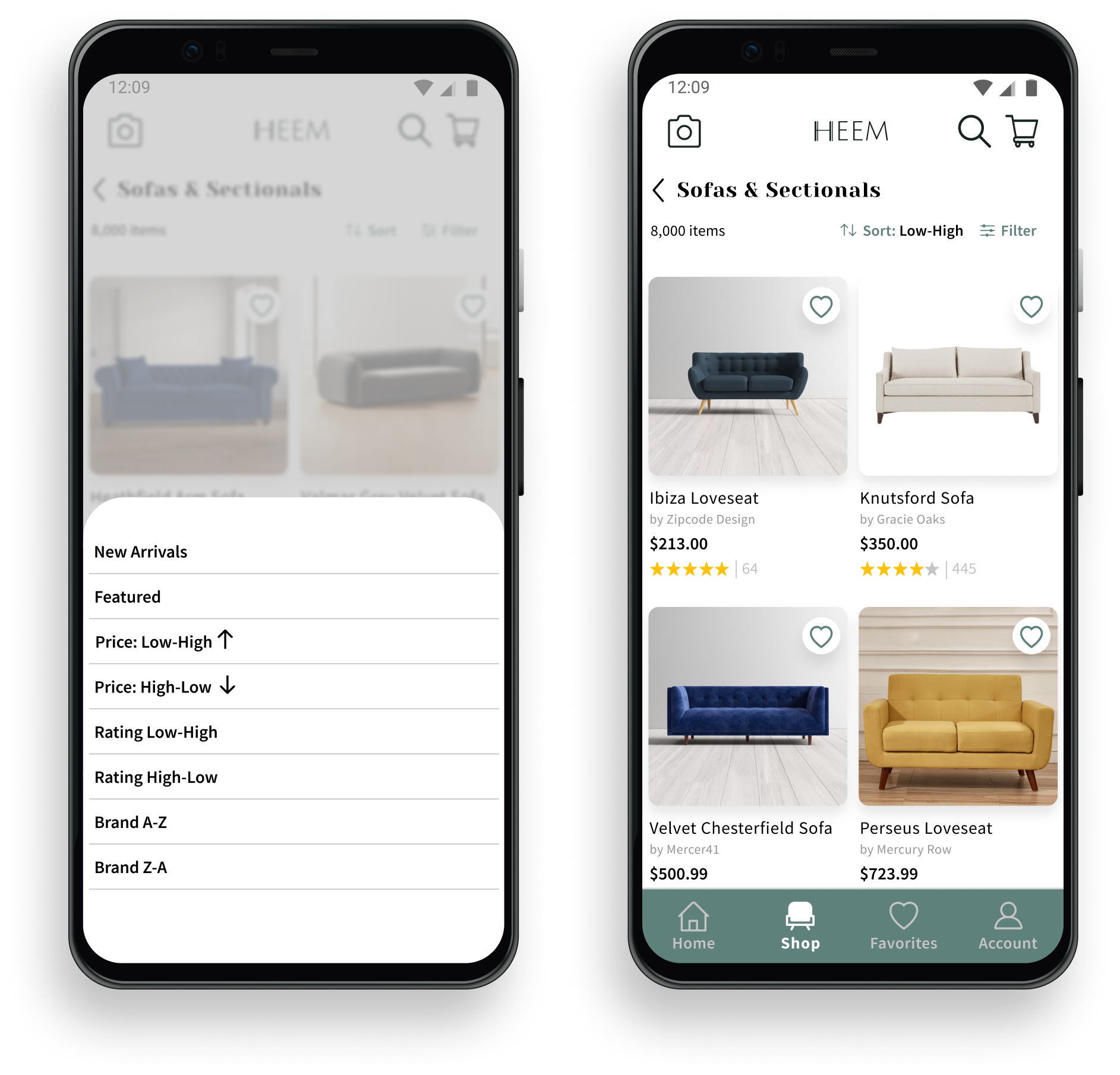
Sorting for the user’s needs
Search results are sorted or filtered based on the user’s requirements.

Navigating in a more intuitive way
To allow users to navigate freely within the app, the bottom navigation is accessible at all times except during checkout and augmented reality.
Discovering a universal language
Because augmented reality is still new to many markets and not widely used, there is no universal icon people associate with it. To avoid confusion, a 3D icon is paired with instructional text to increase understandability.

Using clear and simple lingo
Iconography and text instruct users unfamiliar with augmented realty how to use the app. By scanning the space, the furniture is automatically placed in an optimal area in the room, providing a starting point for the user to view and adjust if needed.
Let’s see how it fits
To confirm the furniture will fit in a space users tap on the item to view the dimensions.
All color options can be seamlessly viewed in augmented reality by selecting the colors listed beside the item.
Reflections
Usability testing participants in both rounds had a lot of feedback especially regarding augmented reality. With so many comments I learned the value in carefully synthesizing the data to make thoughtful and purposeful iterations with the understanding that each change has an affect on other aspects of the UI and user experience.
Further testing is needed to evaluate the 2nd iterations and their effectiveness as well as A/B testing to determine the most global iconography.