

Adding a social feature to keep music listeners connected.
Background
Teens use musical tastes as a badge of identity, deep catalogs provide a shared context for geeking out, and playlists are still an object of courtship. Spotify wants to make a move into helping that connection further. It already has some core capabilities, like following artists or friends, and a basic feed of activity. Spotify would like to develop a social feature that increases engagement and adds value for users.
Role: UX Designer
Timeline: 3 weeks
Tools: Figma, Pen & Paper
Platform: Android
The Challenges
The new social feature will need to align with Spotify’s existing designs.
Spotify’s users view the app as a streaming music app only and don’t see the app as a social platform.
Project Goals
Create an easy way for users to share their music.
Design an add on feature that increases user’s engagement with each other.
My Approach
Determine the successes and needs improvement areas of how competitors enable users to share music and be socially engaged.
Evaluate how users currently share and discover music.
Explore how to allow users to enjoy sharing and discovering new music with others.
Research & Empathize
Sharing music forms connections
I did market research and a competitor analysis of some widely used music streaming apps and browsed forums, app reviews, and the company’s community page to get an understanding of where Spotify stood in the music streaming market as well as a basic understanding of what Spotify listeners wanted. I did interviews with Spotify’s target users, which revealed some insights.
Users will choose what’s easiest
Music sharing is a low priority
Playlists are popular
An app’s song recommendations aren’t accurate
Define
Looking at playlists on a friend’s profile feels like an invasion of privacy.
To identify the problem to solve, I listed some pain points users experience when sharing music and answered 5 W questions:
Who’s experiencing the problem?
What is the problem?
What tasks are they trying to accomplish, and what’s standing in their way?
Where does the problem present itself?
Why does it matter?
Ideate
Active messaging within the Spotify app.
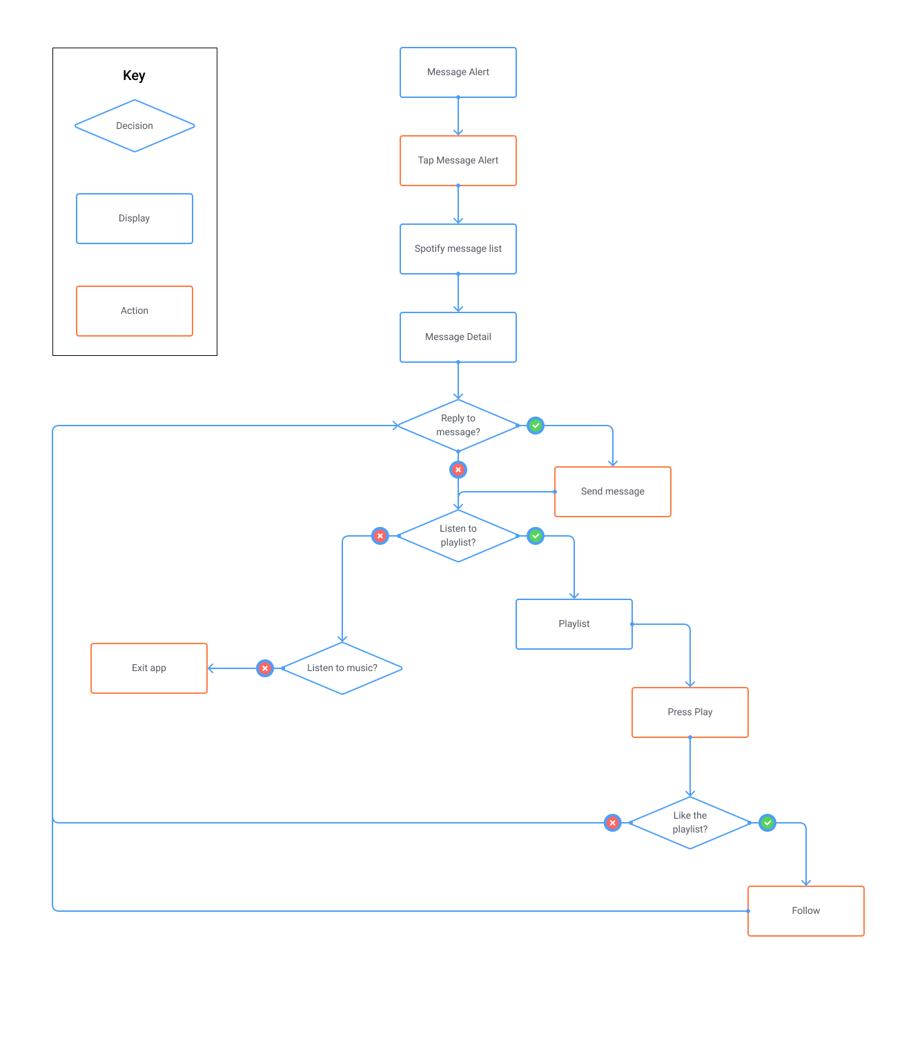
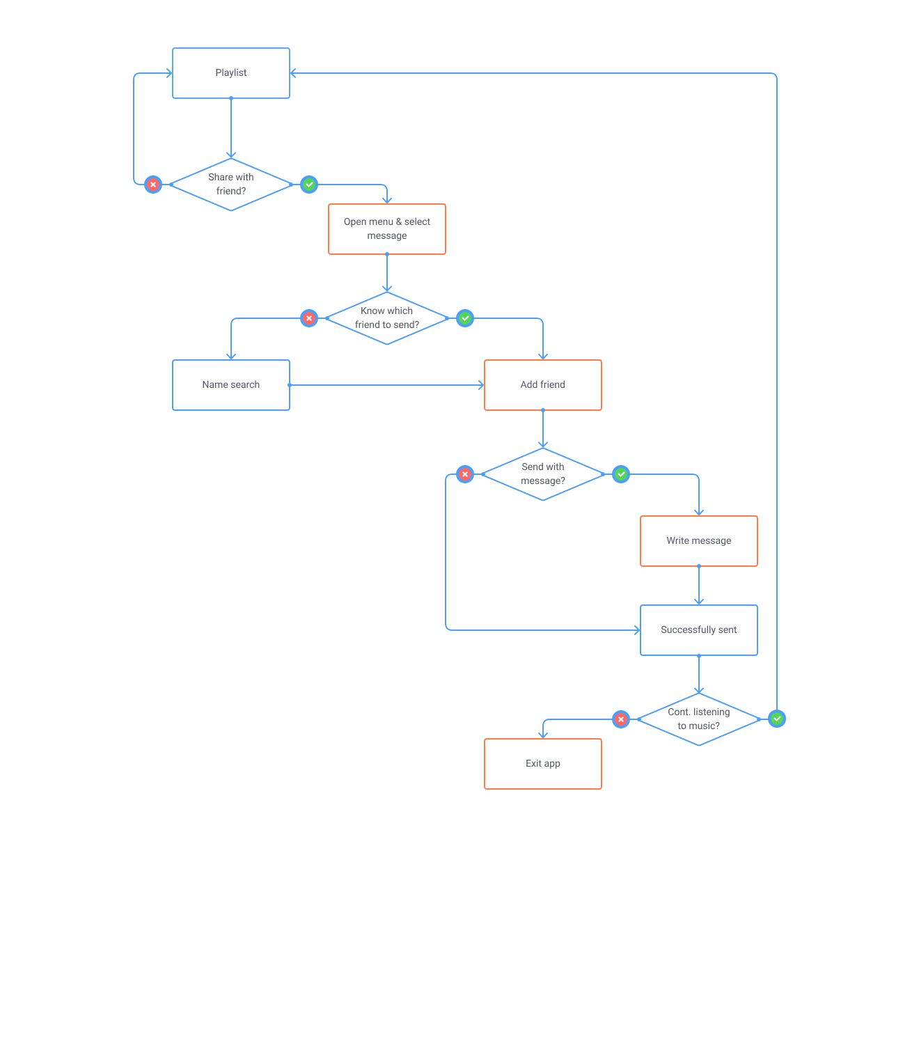
I used a mind map to explore all possible solutions, and determined placing a messaging feature front and center on playlists would prompt users to actively share music with friends, and dissipate feelings of intrusion. In addition, expanding messaging to not just friends but all users would allow music listeners to form new connections. To realize the steps users would take to access the messaging feature, I created user flows focused on 2 tasks: viewing a message receive, and sharing a personally created playlist. I quickly developed ideas by rough sketching screens that required new designs on the 2 tasks.
Task #1: Dez received a Spotify message alert on his phone and reads the message.
Task #2: Dez shares a playlist that he created with his friend.
Prototype & Test Round 1
Does it look and feel familiar?
I wanted to ensure the UI for the new screens aligned with Spotify’s established design elements and user flow patterns early on, so I created high fidelity wireframes and applied the UI for the first round of usability testing. I focused on following Spotify’s established design elements and user flow patterns to maintain consistency throughout the app. I kept the UI simple and in line with other messaging apps to ensure a minimal learning curve.

Success rate and ease of use
I completed usability testing with 3 participants with an average age of 30 and noted the ease of use, success rate, time of completion, and general views on 5 tasks:
Read a newly received message
Listen to a playlist in a message
View the song list in the message
How to share playlist with friend
Send playlist to a friend in a message

Iterate
Aligning with expectations

Clear notifications
The send New Message button was one of the first things users noticed on the screen. The size, location, and weight created an imbalance in visual hierarchy. So I moved changed the iconography to be more familiar and moved it to the upper right corner.
Participants understood green dots beside messages to mean the user is currently online. To eliminate confusion, I changed the color to white to match the notification in the bottom nav.
All users mentioned they were expecting there to be a notification on Message in the bottom nav. This was also common for most messaging apps, so I added a white icon to indicate a new message.
Increase color contrast for readability
All users knew how to play a playlist within a message, but at 5.66 seconds the average time of completion was high. Users said it wasn’t initially clear that the image had a play button, so I made the button background a solid dark color and the play icon white for high contrast and increased detectability.
With a completion rate of 33%, it was clear that users weren’t sure how to view the song list from the messaging screen. Instead of the name of the playlist creator, I changed the text to the number of songs. This would indicate to the user the songs could be viewed by selecting the surrounding box.
Usability Testing Round 2
What would you use?
In this 2nd round of testing I wanted to test the effectiveness and use of the iterations from the previous testing. I did a usability testing with 4 participants who had used Spotify within the last month.
In this round of testing one of the most notable mentions was the participant’s use of messaging apps. 2 of the users gave the Spotify messaging feature a low usefulness rating as they said they currently share music amongst their friends through email or more widely used messaging apps such as Facebook Messenger. They didn’t see a need for another messaging app on their phones and weren’t convinced they’d use the messaging feature in Spotify. To reference a pattern I realized during the empathize phase: Users will choose what’s easiest & music sharing is low priority.
Increase a feature’s value to users
With this in mind, I went back to my 5 W questions and mind map to get more insight into what I might have missed. After some brainstorming, I decided to move forward with the 2nd iterations. Other developments would need to be made to increase the value and usefulness of the messaging feature if it were to continue with future iterations.
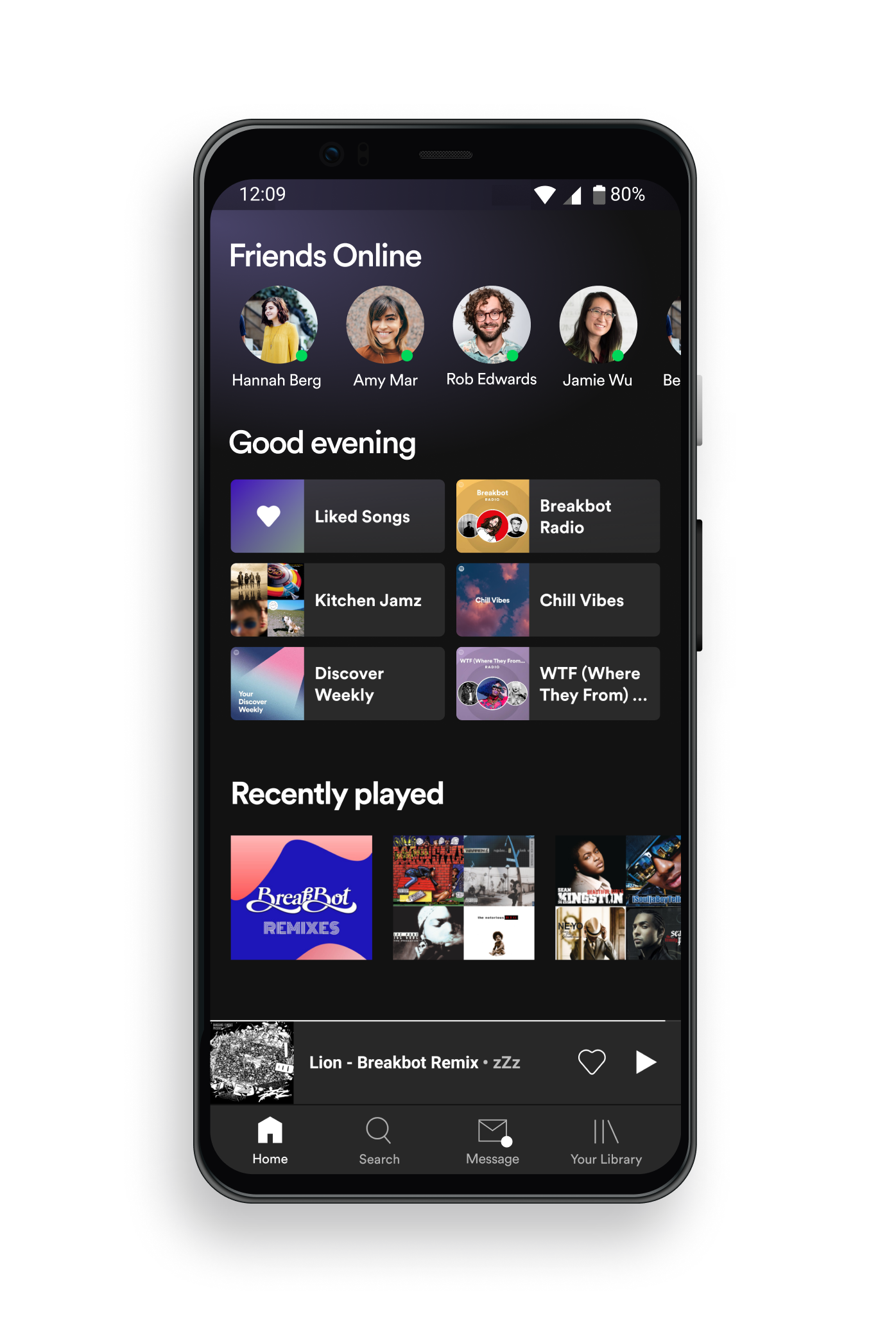
Chat with friends now
Users are more likely to engage with one another if they know a friend is online. So I created a Friends Online section at the top of the home screen to create a social element right when the app is opened.
Connect with likeminded listeners
to allow users a way of meeting other users with similar tastes in music, I created a comment section on playlists. Users swipe left on a playlist to reveal a comment board for all the followers of that playlist.

Reflections
Looking ahead
This project was an invaluable learning experience for me and highlighted the importance of the Define phase. Looking back, I feel I focused too intently on the idea of sharing music rather than discovering music and it’s connection to people. In my mind map were some great ideas, but in my focus on sharing music with ease and eliminating the awkwardness of perusing friend’s profiles, I missed some opportunities to develop some great features.
The messaging function alone wasn’t valuable enough for users to justify using it, however, through the addition of other social features messaging within the app can be a success. Future research is needed to discover features that enhance the social aspect to Spotify and how messaging can help support them.